
For as long as I can remember, turquoise has been my favorite color!
(What’s yours?)
Just for fun, I Googled the word “turquoise”, and look what I found! I love the map of ‘usage’, showing the use of the word turquoise first peaked around the time I was born…..maybe that’s why I love it!
tur·quoise
ˈtərˌk(w)oiz/
noun
noun: turquoise
-
1.a greenish-blue color.“the turquoise waters of the bay”
-
2.a semiprecious stone, typically opaque and of a greenish-blue or sky-blue color, consisting of a hydrated hydroxyl phosphate of copper and aluminum.
Origin
late Middle English: from Old French turqueise ‘Turkish (stone).’

Use over time for: turquoise
OK, so anyway it’s defined as “a greenish blue color”
Really?? To the kid (yours truly) who knew the name of each color in a box of 128 Crayolas, that just isn’t quite good enough! After all, couldn’t you also define aqua or teal the same way?
Yes! And I’ve been asked that more than a few times in all the years I’ve made color my vocation, as well as avocation!
OK, in a moment I’ll show you why this is coming up today, but just let me say that color IS somewhat subjective, especially with tertiary colors (comprised of a primary + secondary color, ie blue-green). In the 80’s TEAL was all the rage ; that teal tended to have more of a green cast than blue. Aqua has long been a favorite of mine too, but it tends to have more of a \ blue cast. Turquoise, at least to me, is the perfect blend of blue and green! It can be intense and bright, or soft and light…..that’s what makes it fun to decorate with: the fun is in LAYERING more than one shade and varying the texture…but I’m getting ahead of myself.
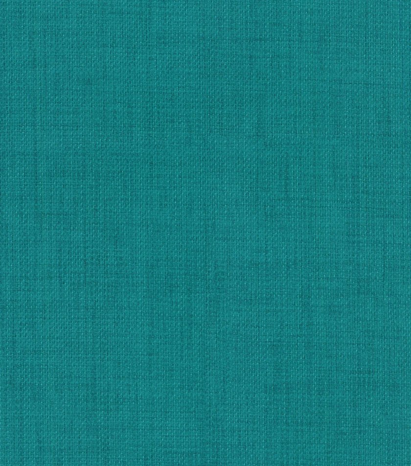
Just a quick note about this sample of TEAL fabric, above: when I was working with couples to decorate their homes, my presentations often included samples of fabric, wallpaper, paint etc. Teal WAS popular then, of course, so it was part of many color schemes (and I’ve always used shades of blue-green) But to a person, EVERY SINGLE time I showed a sample that included teal, the female would call it BLUE & the male would call it GREEN! It NEVER failed! (Now keep in mind that color rendition online depends greatly on your screen resolution, so we may not ALL be seeing the same thing!)
Besides the screen resolution, and the fact that color is subjective and teal has both blue and green tones…..there is the fact that most men are colorblind, at least to some degree:
“Men are much more likely to be colorblind than women because the genes responsible for the most common, inherited color blindness are on the X chromosome. Males only have one X chromosome, while females have two X chromosomes.”

Ahhhhhh….back to what brought me here today….but first, this wonderful photograph by Douglas Fisher just makes me so happy! Isn’t it delightful?!
So…yesterday was the first sunny Saturday we’ve had in East Texas in such a long time, & I happened not to be showing any houses either; on top of that the temperature was in the 70’s! Not only is that just an ahhhhh moment all by itself, it is also perfect painting weather! As you know, I’m waiting for the perfect convergence of weather conditions & contractor timing to get the exterior of my cottage painted! (I’d like to say I’m PATIENTLY waiting, but that might be a stretch…!) So yesterday I cheered myself up by painting 3 of my exterior doors – yay! I don’t want to paint the 2 that face the street until the brick is the right color, but the doors I use daily – to my kitchen, master bedroom, and laundry room are mainly just seen by me; I decided they were ready for color!
Now when I come home, I’ll be greeted by my lovely turquoise doors, and maybe that’ll help me wait for the white brick!

This is a color chip of Sherwin Williams Vintage Vessel, my exterior door choice from the beginning. For one thing, I bet you don’t think it looks very TURQUOISE here…..am I right?!
Here’s why: if the color chip itself looked like my desired door color, it would look awful actually painted ON the door! The science of WHY is more than we can go into here, but suffice it to say that the color is affected by everything around it, as well as the sheen, amount and quality of natural light it will be exposed to, and the surface it’s painted on. The funniest example of this principal is the wall colors we see used so often in kids’ rooms: you can tell when the parents let them pick out the color, & they picked one they just loved on the chip…..but painted on the walls it often looks like a giant popsicle! Even worse, when the parents choose a semi-gloss finish (for cleanability they say) the reflection magnifies the brightness!
Now, since I got the wild hair to paint on the weekend, I had this chip color-matched and mixed up in a Behr exterior latex at Home Depot. They did a fabulous job with the match; I couldn’t be happier with the color! I chose an eggshell finish, more in keeping with the cottage style I’m creating; keep in mind that while semi-gloss is more authentic to the 50’s era turquoise so many love, the reflection would have changed the color significantly in an exterior application where sunlight is a huge factor. Also, I AM looking for subtlety…when the exterior is finished there will be quite a bit of white brick, and 5 exterior doors: if the shade and sheen of turquoise was too bright, the effect would be garish!
Ta-dah! See what you think:
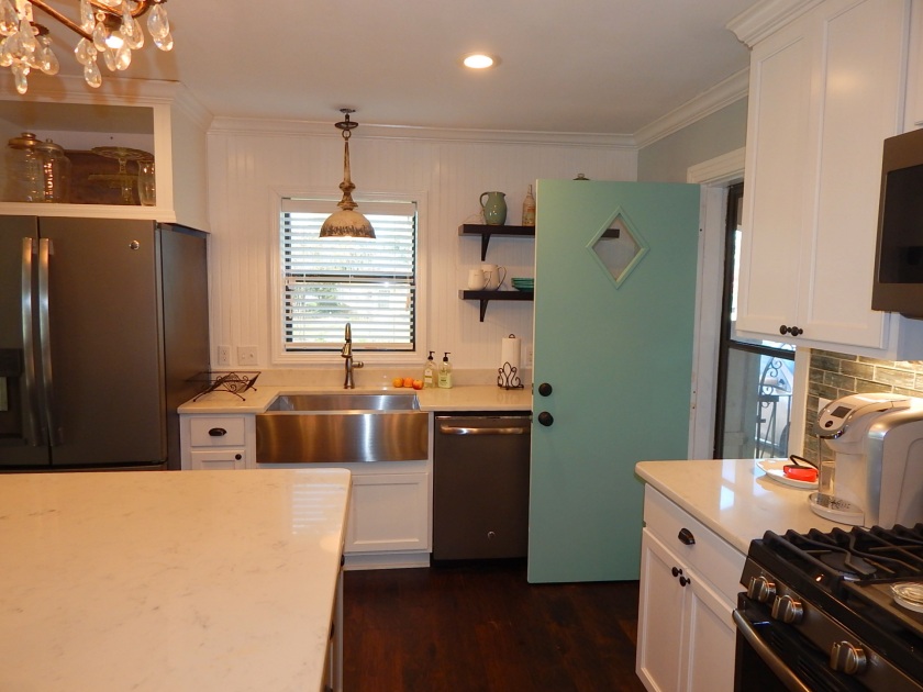
I LOVE the subtle turquoise shade combined with the original vintage door! I’m only showing you the interior for now because I want to save the reveal with the white brick and gray shutters for when that project is completed!
When we do the exterior, we’ll move the full-glass-panel storm door from the front to this door; then you’ll have a beautiful view of the arched iron gate from the door.
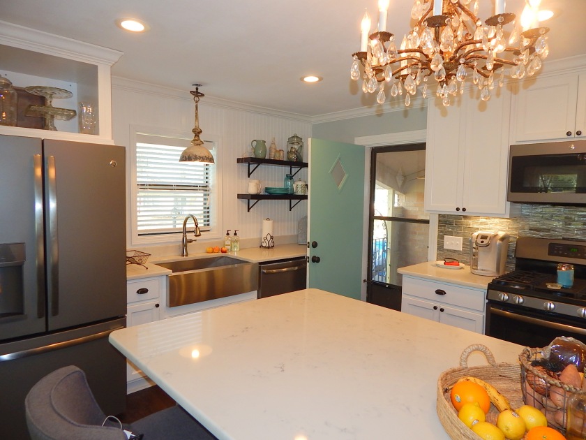
So now you’ve seen one of my 3 new turquoise doors! I thought it might be fun to see a few of my favorite turquoise/aqua/teal pretties….the color is repeated throughout my interiors, in varying textures.
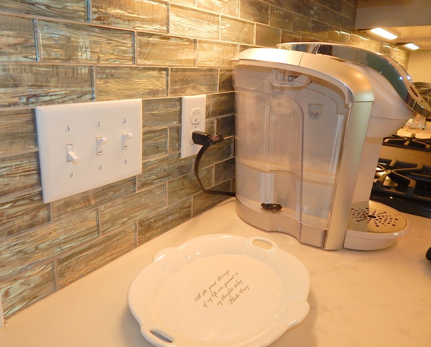
Backsplash: glass subway tile


Pottery, glass & metal; vintage & artisan-made
(those are old Fiesta plates; I can’t put them in the microwave!)
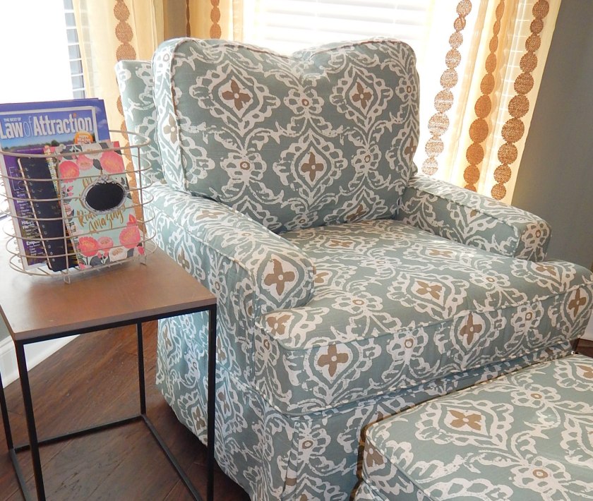
Cushy rocking chair
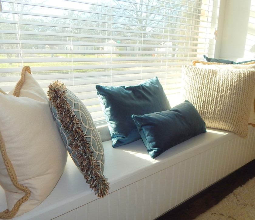
Sunny window seat
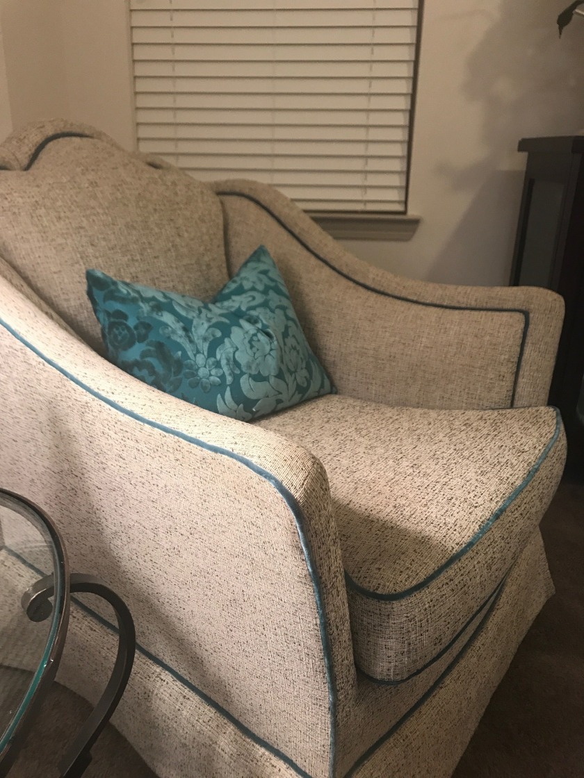
Chairs with teal velvet piping & pillows
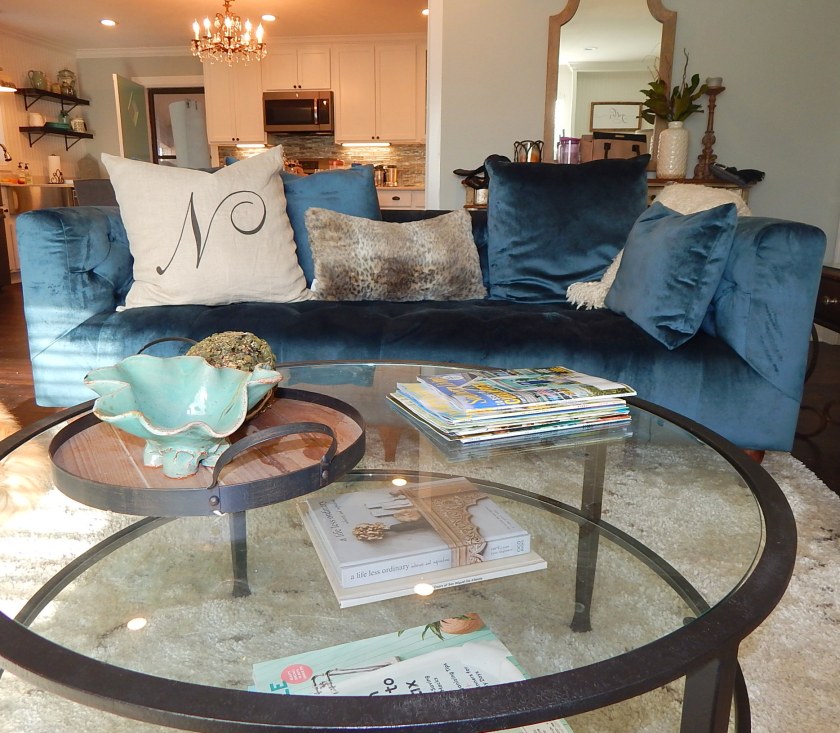
Cozy seating…(and a favorite pottery bowl)
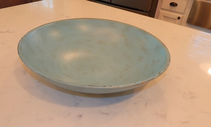
Favorite wood bowl
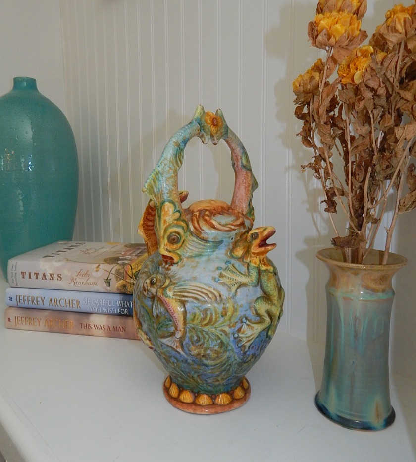
Favorite hand-made pottery vase bought in Italy (I love the one beside it too)
What is your favorite color to decorate with? I hope you’ll tell us in the comments below…in case you can’t tell, I love the subject of COLOR!
Thanks for helping me celebrate all things turquoise….


This is also my favorite color! I have loved it ever since I read about a beige and aqua bedroom in a Nancy Drew book. I had a tiny aqua Princess phone that I used with my Barbie dolls and that was the very best color ever! I also love coral and I think the two together are awesome. For some unknown reason, my husband doesn’t want my front door painted that color, but all my back doors are. Just wait until I get a chance to do the front one! I got the gallon of paint from my daughter who was talked into a gallon of paint for one door. So now I have a mirror, a side table and 3 doors painted that color. I would have chosen a slightly greener tone for myself, but the bluer version goes with my brick better anyway.
LikeLike
Love it Carla! You can show us your back doors! Way to keep color in your life!
LikeLike
Love love LOVE, Nancy! ❤️
LikeLike
Thank you Shelly!
LikeLike